CSS基础
css基本概念
CSS是 Cascading Style Sheets 的首字母缩写,中文翻译是层叠样式表。
目的是为了让网页元素的样式更加丰富(字体,颜色,边距,高度,宽度,背景图片,网页定位,网页浮动),也为了让网页的内容和样式能拆分开,CSS由此思想而诞生,有了CSS,html中大部分表现样式的标签就废弃不用了,html只负责文档的结构和内容,表现形式完全交给CSS,html文档变得更加简洁。
基本语法
引入方式
行内引入
<!DOCTYPE html>
<html lang="en">
<head>
<meta charset="UTF-8">
<meta name="viewport" content="width=device-width, initial-scale=1.0">
<title>Document</title>
</head>
<body>
<!--行内样式-->
<h1 style="color: green;">Hello World!</h1>
</body>
</html>
html内部引入
<!DOCTYPE html>
<html lang="en">
<head>
<meta charset="UTF-8">
<meta name="viewport" content="width=device-width, initial-scale=1.0">
<title>Document</title>
<!--内部样式-->
<style>
h1{
color: red;
}
</style>
</head>
<body>
<h1>Hello World!</h1>
</body>
</html>
html外部引入
style.css文件
<style>
h1{
color:yellow ;
}
</style>
css<!DOCTYPE html>
<html lang="en">
<head>
<meta charset="UTF-8">
<meta name="viewport" content="width=device-width, initial-scale=1.0">
<title>Document</title>
<!--外部样式-->
<link rel="stylesheet" href="css/style.css" />
</head>
<body>
</body>
</html>
html就近原则
<!DOCTYPE html>
<html lang="en">
<head>
<meta charset="UTF-8">
<meta name="viewport" content="width=device-width, initial-scale=1.0">
<title>Document</title>
<!--内部样式-->
<style>
h1{
color: red;
}
</style>
<!--外部样式-->
<link rel="stylesheet" href="css/style.css" />
</head>
<body>
<!--行内样式-->
<h1 style="color: green;">Hello World!</h1>
</body>
</html>
html上述代码最后会显示绿色
选择器
标签选择器
<!DOCTYPE html>
<html lang="en">
<head>
<meta charset="UTF-8">
<meta name="viewport" content="width=device-width, initial-scale=1.0">
<title>Document</title>
<!-- 标签选择器 -->
<style>
h1{
color: red;
}
h2{
color: green;
}
h3{
color: blue;
}
</style>
</head>
<body>
<h1>h1</h1> 显示红色
<h2>h2</h2> 显示绿色
<h3>h3</h3> 显示蓝色
</body>
</html>
htmlid选择器
<!DOCTYPE html>
<html lang="en">
<head>
<meta charset="UTF-8">
<meta name="viewport" content="width=device-width, initial-scale=1.0">
<title>Document</title>
<!-- Id选择器 id唯一性-->
<style>
#demo1{
color: red;
}
#demo2{
color: green;
}
#demo3{
color: blue;
}
</style>
</head>
<body>
<h1 id="demo1">h1</h1> 显示红色
<h2 id="demo2">h2</h2> 显示绿色
<h3 id="demo3">h3</h3> 显示蓝色
</body>
</html>
html类选择器
<!DOCTYPE html>
<html lang="en">
<head>
<meta charset="UTF-8">
<meta name="viewport" content="width=device-width, initial-scale=1.0">
<title>Document</title>
<!-- 类选择器 -->
<style>
.demo1{
color: red;
}
.demo2{
color: green;
}
.demo3{
color: blue;
}
</style>
</head>
<body>
<h1 class="demo1">h1</h1> 显示红色
<h1 class="demo1">h1</h1> 显示红色
<h2 demo2="demo2">h2</h2> 显示绿色
<h2 demo2="demo2">h2</h2> 显示绿色
<h3 demo3="demo3">h3</h3> 显示蓝色
<h3 demo3="demo3">h3</h3> 显示蓝色
</body>
</html>
html优先级 (优先级 id选择器 > 类选择器 > 标签选择器 )
<!DOCTYPE html>
<html lang="en">
<head>
<meta charset="UTF-8">
<meta name="viewport" content="width=device-width, initial-scale=1.0">
<title>Document</title>
<!-- 优先级 id选择器 > 类选择器 > 标签选择器 -->
<style>
#demo1{
color: red;
}
.demo2{
color: green;
}
h1{
color: blue;
}
h2{
color: wheat;
}
</style>
</head>
<body>
<h1 id="demo1" class="demo2">h1</h1> 显示红色
<h1 id="demo1">h1</h1> 显示红色
<h1 class="demo2">h1</h1> 显示绿色
<h2 id="demo1" class="demo2">h2</h2> 显示红色
</body>
</html>
html层次选择器
后代选择器:在某个元素的后面
<!DOCTYPE html>
<html lang="en">
<head>
<meta charset="UTF-8">
<meta name="viewport" content="width=device-width, initial-scale=1.0">
<title>Document</title>
<!-- 层次选择器 -->
<style>
div p{
color: red;
}
</style>
</head>
<body>
<div>
<p>p标签</p>
<p>p标签</p>
<p>p标签</p>
</div>
</body>
</html>
html子选择器,子一代
<!DOCTYPE html>
<html lang="en">
<head>
<meta charset="UTF-8">
<meta name="viewport" content="width=device-width, initial-scale=1.0">
<title>Document</title>
<!-- 层次选择器-子一代选择器 -->
<style>
div > p{
color: red;
}
</style>
</head>
<body>
<div>
<p>p标签</p>
<p>p标签</p>
<p>p标签</p>
<span><p>p标签</p></span>
</div>
</body>
</html>
html相邻兄弟选择器(+)
<!DOCTYPE html>
<html lang="en">
<head>
<meta charset="UTF-8">
<meta name="viewport" content="width=device-width, initial-scale=1.0">
<title>Document</title>
<!-- 层次选择器-相邻兄弟选择器(+) -->
<style>
p.selected + p {
color: red;
}
</style>
</head>
<body>
<p>这是第一段文字</p>
<p class="selected">这是第二段文字</p>
<p>变成红色</p>
</body>
</html>
html通用兄弟选择器(~)
<!DOCTYPE html>
<html lang="en">
<head>
<meta charset="UTF-8">
<meta name="viewport" content="width=device-width, initial-scale=1.0">
<title>Document</title>
<!-- 层次选择器-通用兄弟选择器(~) -->
<style>
p.selected ~ p {
background-color: yellow;
}
</style>
</head>
<body>
<p>这是第一段文字</p>
<p class="selected">这是第二段文字</p>
<p>这是第三段文字</p>
<p>这是第四段文字</p>
</body>
</html>
html结构伪类选择器
eg1:
<!DOCTYPE html>
<html lang="en">
<head>
<meta charset="UTF-8">
<meta name="viewport" content="width=device-width, initial-scale=1.0">
<title>Document</title>
<style>
/* 使用 :first-of-type 选择器选中第一个 <h2> 元素: */
h2:first-of-type {
color: red;
}
/* :last-of-type 选择器选中最后一个 <p> 元素: */
p:last-of-type {
font-weight: bold;
}
</style>
</head>
<body>
<div>
<h2>标题 1</h2>
<p>段落 1</p>
<h2>标题 2</h2>
<p>段落 2</p>
</div>
</body>
</html>
htmleg2:
<!DOCTYPE html>
<html lang="en">
<head>
<meta charset="UTF-8">
<meta name="viewport" content="width=device-width, initial-scale=1.0">
<title>Document</title>
<style>
/* 要选中奇数位置的列表项 */
li:nth-of-type(odd) {
background-color: gray;
}
/* 要选中每隔两个的列表项(例如第 2、第 4、第 6 等),可以使用 */
li:nth-of-type(2n) {
color: blue;
}
</style>
</head>
<body>
<div>
<h2>标题 1</h2>
<p>段落 1</p>
<h2>标题 2</h2>
<p>段落 2</p>
</div>
<ul>
<li>项目 1</li>
<li>项目 2</li>
<li>项目 3</li>
<li>项目 4</li>
<li>项目 5</li>
</ul>
</body>
</html>
htmleg3(如果一个父元素中只有一个特定类型的子元素):
<!DOCTYPE html>
<html lang="en">
<head>
<meta charset="UTF-8">
<meta name="viewport" content="width=device-width, initial-scale=1.0">
<title>Document</title>
<style>
p:only-of-type {
border: 1px solid black;
}
</style>
</head>
<body>
<div>
<p>这是唯一的段落</p>
<span>这是一个 span 元素</span>
</div>
</body>
</html>
html超链接伪类
<!DOCTYPE html>
<html>
<head>
<style>
/* :link:用于未访问过的链接 */
a:link {
color: blue;
}
/* :visited:用于已访问过的链接。 */
a:visited {
color: purple;
}
/* :hover:当鼠标悬停在链接上时。 */
a:hover {
color: red;
text-decoration: underline;
}
/* :active:当链接被激活(比如点击时)。 */
a:active {
color: green;
}
</style>
</head>
<body>
<h2>超链接示例</h2>
<p>
<a href="https://www.example1.com">未访问的链接 - 示例 1</a>
</p>
<p>
<a href="https://www.example2.com">已访问的链接 - 示例 2</a>
</p>
</body>
</html>
html属性选择器
<!DOCTYPE html>
<html lang="en">
<head>
<meta charset="UTF-8">
<meta name="viewport" content="width=device-width, initial-scale=1.0">
<title>Document</title>
<style>
p[data-info^="imp"] {
background-color: yellow;
}
p[data-info$="with"] {
border: 1px solid blue;
}
</style>
</head>
<body>
<p data-info="imp-start">这是一个段落</p>
<p data-info="end-with">这是一个段落</p>
</body>
</html>
html常用标签
文档结构标签:
<html>:HTML 文档的根标签。<head>:包含文档的元信息,如标题、样式表链接、脚本等。<title>:定义文档的标题,显示在浏览器的标题栏。<body>:包含文档的可见内容。
文本相关标签:
<h1>-<h6>:不同级别的标题标签。<p>:段落标签。<br>:换行标签。<strong>:使文本加粗,强调重要性。<em>:使文本倾斜,强调重点。
列表标签:
<ul>:无序列表(Unordered List),列表项使用<li>标签。<ol>:有序列表(Ordered List),列表项同样使用<li>标签。
链接标签:
<a>:用于创建链接,通过href属性指定链接的目标地址。
图像标签:
<img>:用于插入图片,通过src属性指定图片的路径。
表格标签:
<table>:定义表格。<tr>:表格行。<td>:表格单元格。<th>:表头单元格。
表单标签:
<form>:定义表单。<input>:输入框,类型多样,如文本、密码、单选、复选等。<textarea>:多行文本输入区域。<select>:下拉列表。<button>:按钮。
文本样式
字体样式
font-family:指定字体,例如:font-family: Arial, sans-serif;font-size:设置字体大小,如:font-size: 16px;font-weight:控制字体粗细,可取值为normal(正常)、bold(粗体)、bolder(更粗)、lighter(更细)或具体的数值,如400(正常)、700(粗体)等,例如:font-weight: bold;font-style:设置字体样式为normal(正常)、italic(斜体)或oblique(倾斜),例如:font-style: italic;
文本装饰
text-decoration:可用于添加或去除下划线、上划线、删除线等,取值有none(无装饰)、underline(下划线)、overline(上划线)、line-through(删除线),例如:text-decoration: underline;
文本对齐
text-align:控制文本的水平对齐方式,可取值为left(左对齐)、right(右对齐)、center(居中对齐)、justify(两端对齐),比如:text-align: center;
文本缩进
text-indent:设置文本的缩进,例如:text-indent: 2em;
行高
line-height:指定文本的行高,例如:line-height: 1.5;(倍数)或line-height: 20px;(具体像素值)
字母大小写
text-transform:可将文本转换为大写、小写或首字母大写,取值有uppercase(大写)、lowercase(小写)、capitalize(首字母大写),例如:text-transform: uppercase;
文本阴影
text-shadow:添加文本阴影,例如:text-shadow: 2px 2px 4px rgba(0, 0, 0, 0.5);(水平偏移量、垂直偏移量、模糊半径、颜色)
字间距
letter-spacing:调整字符之间的间距,例如:letter-spacing: 2px;
词间距
word-spacing:设置单词之间的间距,例如:word-spacing: 5px;
盒子模型
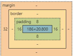
边框border
border:粗细 样式 颜色
外边距margin
margin:0 0 0 0/分别表示上、右、下、左;从上开始顺时针 margin:0 auto /auto表示左右自动
(
使用margin:0 auto居中的前提条件
1.元素必须是块级元素;元素的宽度不能是 auto ,
2.必须有明确的宽度值
3.父元素不能设置 float 或 position: absolute/fixed 等属性,否则 margin: 0 auto 可能无法生效
) margin:4px/表示上、右、下、左都为4px margin:10px 20px 30px/表示上为10px,左右为20px,下为30px/
Padding
Padding:0 0 0 0/分别表示上、右、下、左;从上开始顺时针
圆角边框-border-radius
盒子阴影-box-shadow
浮动
块级元素:独占一行 h1~h6 、p、div、 列表…
行内元素:不独占一行 span、a、img、strong
注: 行内元素可以包含在块级元素中,反之则不可以。
display属性
- block:块元素
- inline:行内元素
- inline-block:是块元素,但是可以内联,在一行
- none:消失
出现高度错位设置 vertical-align为top
float浮动
**假如某个div元素A是浮动的,如果A元素上一个元素也是浮动的,那么A元素会跟随在上一个元素的后边(如果一行放不下这两个元素,那么A元素会被挤到下一行);如果A元素上一个元素是标准流中的元素,那么A的相对垂直位置不会改变,也就是说A的顶部总是和上一个元素的底部对齐。
清除浮动clear
none : 默认值。允许两边都可以有浮动对象
left : 不允许左边有浮动对象
right : 不允许右边有浮动对象
both : 不允许有浮动对象
对于CSS的清除浮动(clear),一定要牢记:这个规则只能影响使用清除的元素本身,不能影响其他元素。
解决父元素高度塌陷问题
1. 使用 overflow 属性
.parent {
overflow: auto;
}
css或
.parent {
overflow: hidden;
}
css2. 为父元素添加 after 伪元素并清除浮动
.clearfix::after {
content: "";
display: table;
clear: both;
}
.parent {
zoom: 1; /* 为了兼容 IE 6/7 */
}
css然后将 clearfix 类应用到父元素上:
<div class="parent clearfix">
<!-- 浮动的子元素 -->
</div>
html3. 使用 display: flex 或 display: grid 布局
.parent {
display: flex;
flex-direction: column;
}
css或者设置为 Grid 布局:
.parent {
display: grid;
}
css例如,在一个电商网站的商品详情页面中,如果商品图片是浮动的,商品描述部分的父元素可能会出现高度塌陷。通过上述方法中的任何一种,都可以确保页面布局的正确性和稳定性。
display与float对比
- **display:**方向不可以控制
- **float:**浮动起来的话会脱离标准文档流,所以要解决父级边框塌陷的问题。
定位
相对定位
相对定位的特点在于:
- 元素仍然占据原来在标准文档流中的空间,不会对其他元素的布局造成影响。
- 通过设置
top、bottom、left和right属性来相对于其原本的位置进行偏移。
例如,如果一个元素原本在页面的左上角,设置 top: 20px; left: 20px; 后,它会相对于原来的位置向下和向右各移动 20 像素。但原来它所占据的空间仍然保留。
<!DOCTYPE html>
<html lang="en">
<head>
<meta charset="UTF-8">
<title>相对定位</title>
</head>
<body>
<div style="height: 100px;">
<!-- 对于其原本的位置向下移动 50 像素 -->
<h1 style="position: relative; top: 20px; left: 20px;">Hello World!</h1>
</div>
</body>
</html>
html绝对定位
- 元素会脱离标准文档流,不再占据原来的空间,其他元素会忽略它原来的位置进行布局。
- 相对于其最近的已定位祖先元素(如果没有已定位的祖先元素,则相对于文档的根元素
<html>)进行定位。
<!DOCTYPE html>
<html lang="en">
<head>
<meta charset="UTF-8">
<title></title>
<style>
.parent {
position: relative;
width: 500px;
height: 500px;
background-color: blue;
}
.child {
position: absolute;
top: 100px;
left: 100px;
width: 200px;
height: 200px;
background-color: green;
}
</style>
</head>
<body>
<div class="parent">
<div class="child">
会脱离标准文档流,不再占据原来的空间
</div>
<div style="background-color: aqua;width: 200px;height: 200px;">
</div>
<div style="background-color: red;width: 200px;height: 200px;">
</div>
</div>
<div style="background-color: red;width: 400px;height: 400px;position: absolute;top: 200px;left: 700px;">
会脱离标准文档流,不再占据原来的空间,如果没有已定位的祖先元素,则相对于文档的根元素
</div>
</body>
</html>
html固定定位
- 元素会脱离文档流,不占据页面空间,其他元素的布局不会受到其影响。
- 相对于浏览器窗口进行定位,无论页面如何滚动,固定定位的元素始终保持在屏幕的固定位置。
<!DOCTYPE html>
<html lang="en">
<head>
<meta charset="UTF-8">
<title></title>
<style>
.fixed-header {
position: fixed;
top: 20px;
right: 0;
width: 100px;
background-color: gray;
}
</style>
</head>
<body>
<div style="height: 1000px;">
<div class="fixed-header">
<h2>这是固定的头部</h2>
</div>
</div>
</body>
</html>
htmlz-index 的使用
z-index 属性用于控制定位元素在垂直于屏幕方向(Z 轴)上的堆叠顺序。
其主要的使用要点包括:
- 仅对定位元素(如绝对定位、相对定位、固定定位)生效。
- 值越大,元素在堆叠顺序中越靠前。
例如,当有多个定位元素重叠时,可以通过设置 z-index 来决定哪个元素显示在上面。
<!DOCTYPE html>
<html lang="en">
<head>
<meta charset="UTF-8">
<title></title>
<style>
.box1 {
position: absolute;
width: 200px;
height: 200px;
background-color: red;
z-index: 1;
}
.box2 {
position: absolute;
width: 150px;
height: 150px;
background-color: blue;
top: 50px;
left: 50px;
z-index: 3;
}
</style>
</head>
<body>
<div class="box1">Box 1</div>
<div class="box2">Box 2</div>
</body>
</html>
html
全部评论